The Way Rebrand
The Way is the largest digital youth ministry in Europe.
The Logo
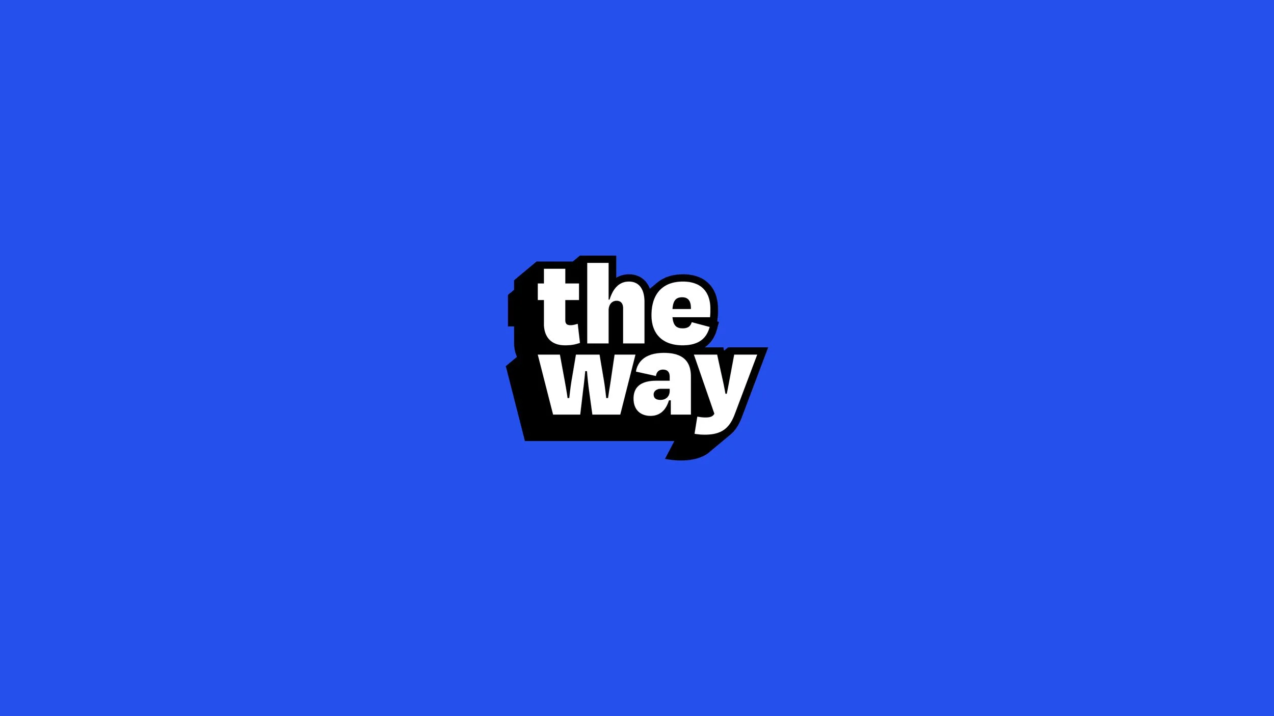
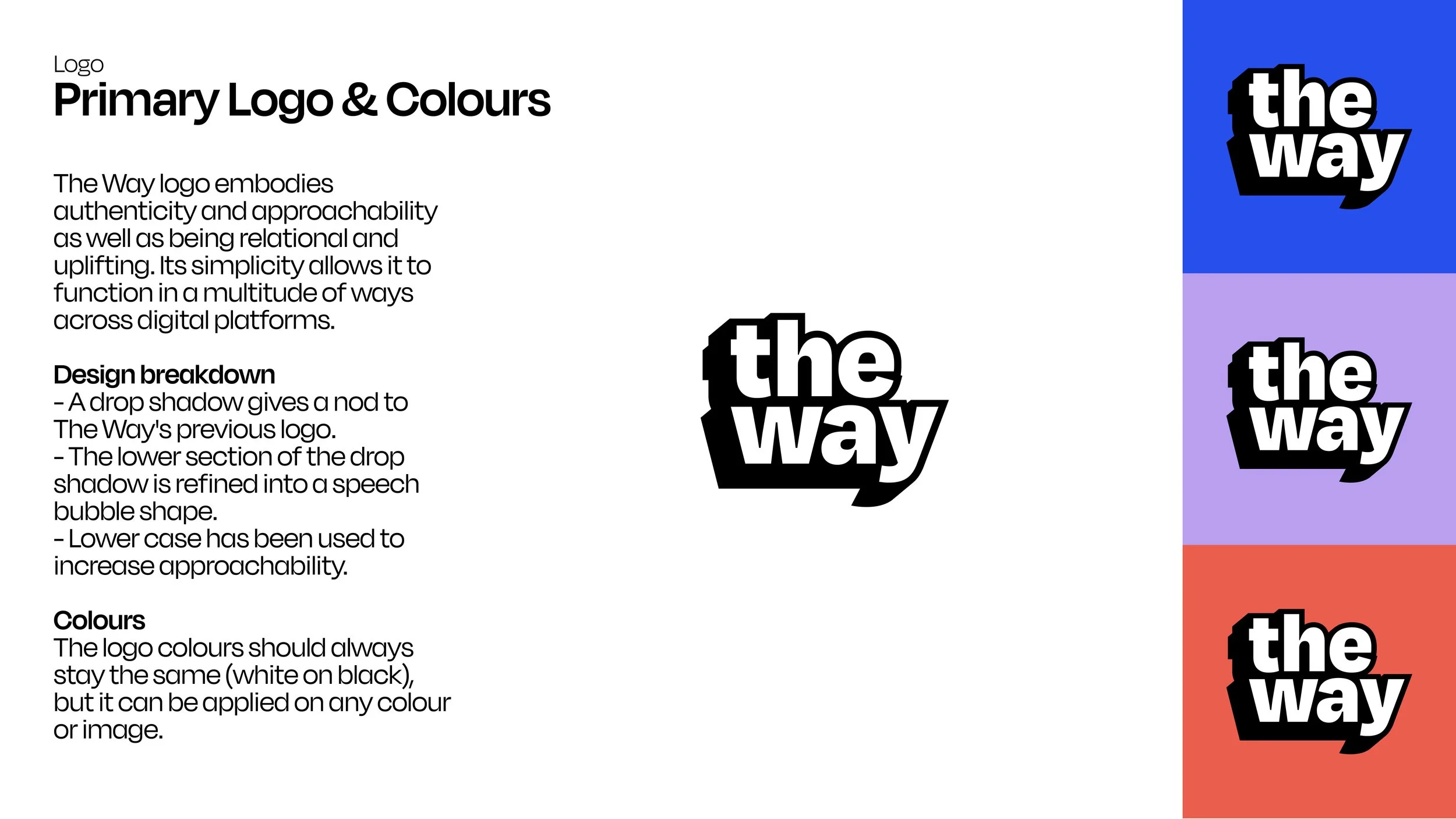
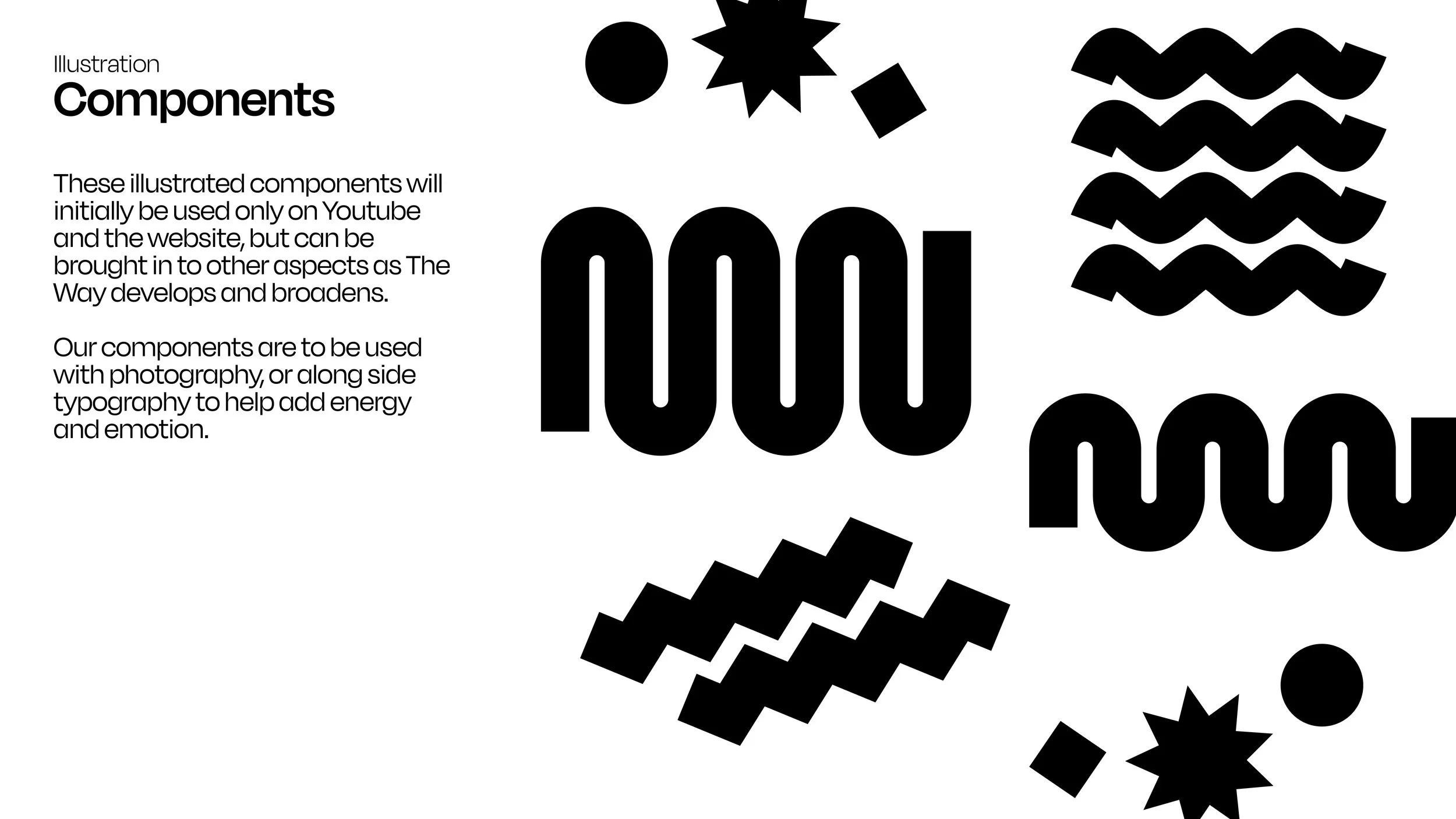
The final logo retains elements of the previous brand through a drop shadow, while aligning with the new tone of Authenticity, Approachability, Relatability, and Uplifting. Additionally, its design echoes the shape of a speech bubble, reflecting the many conversations that The Way creates. You can see some of the rejected logos surrounding the final design.
Colour Scheme
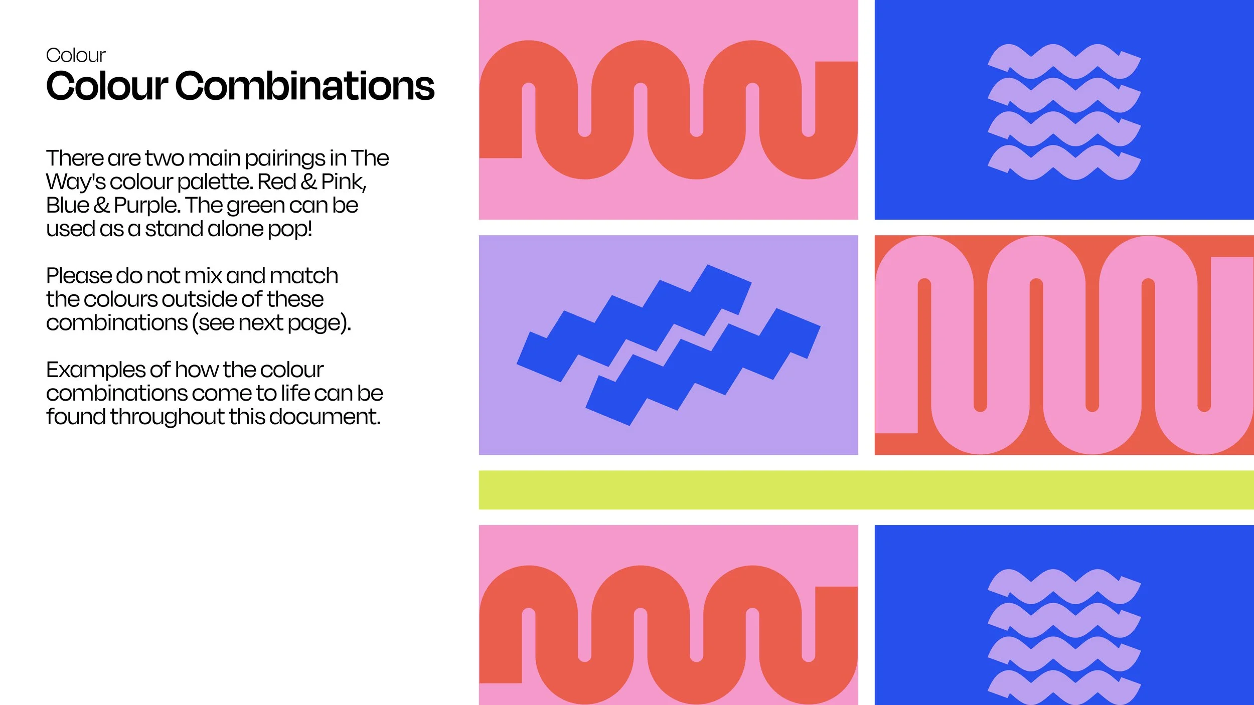
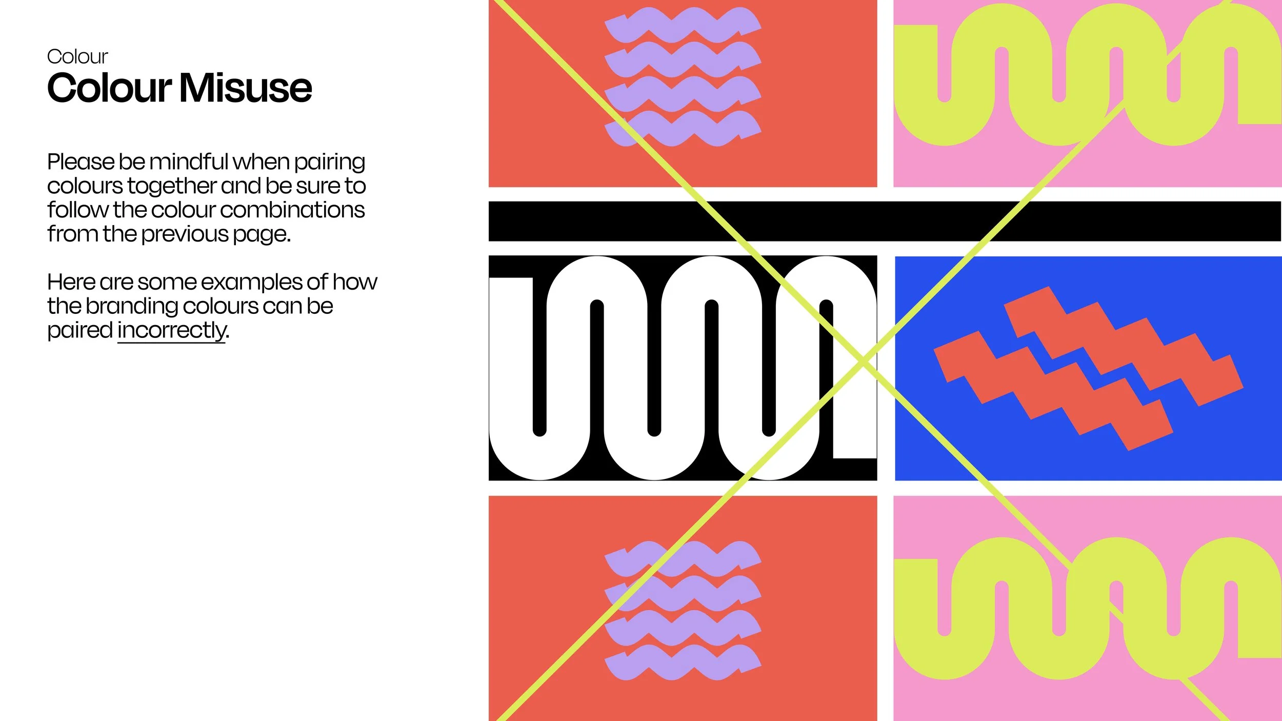
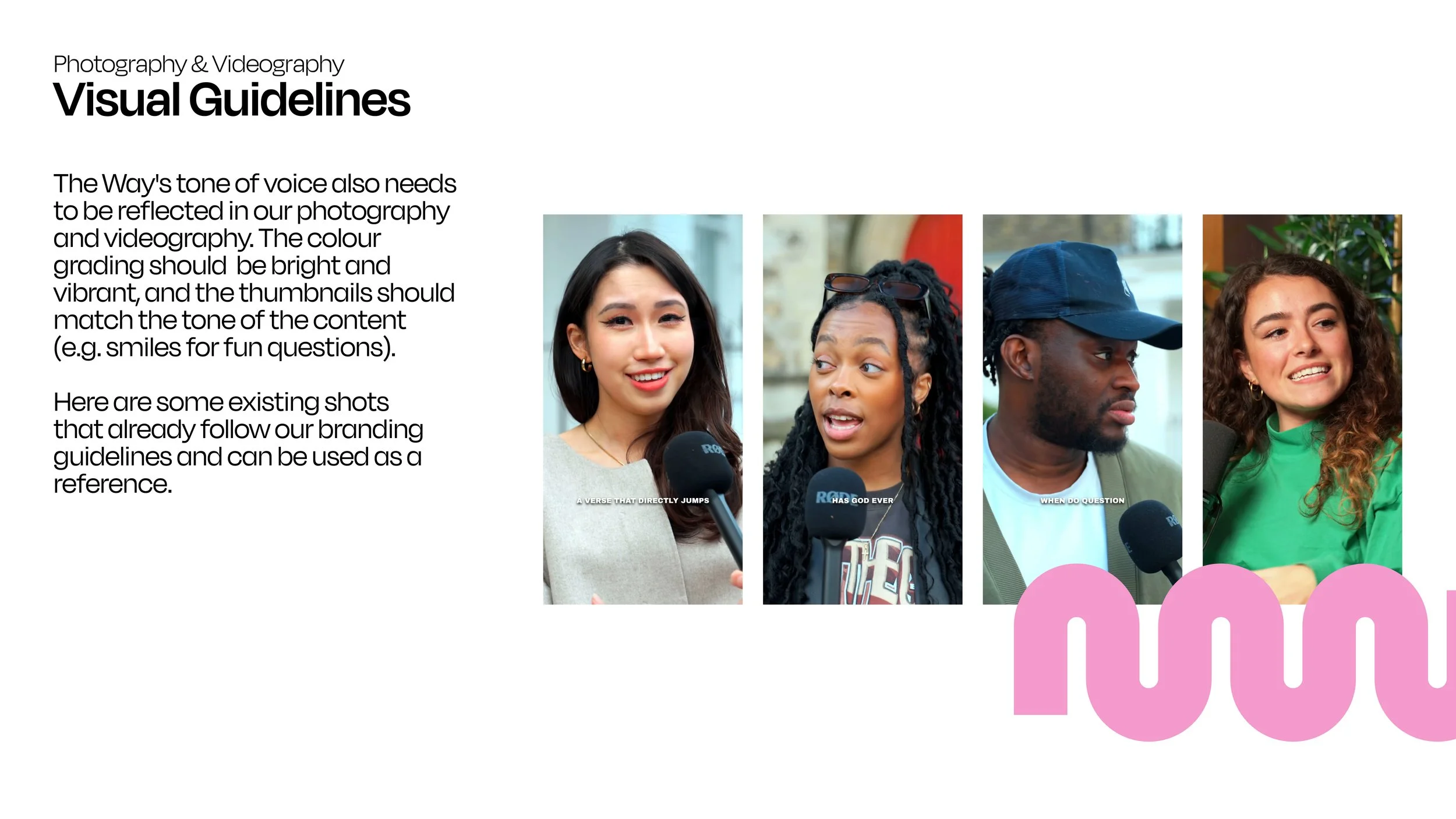
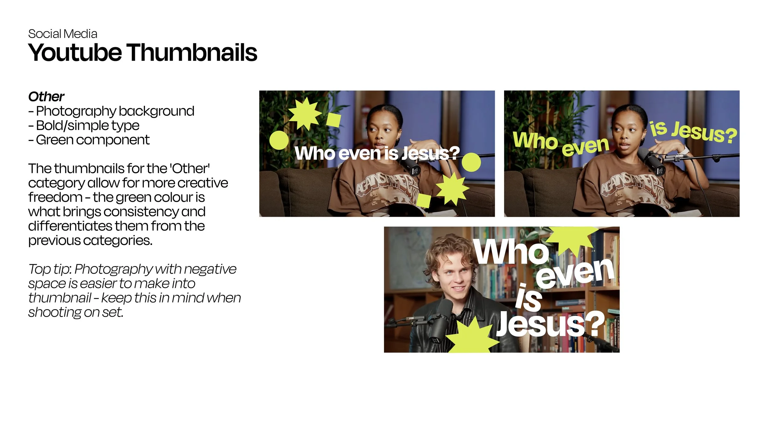
The Way’s content is predominantly digital, featuring photo and video elements. To ensure a vibrant and youthful aesthetic, the colours need to stand out on screen. The branding guidelines outline specific rules for colour usage and pairings, detailing where each colour should be applied and which combinations work best.
Merchandise
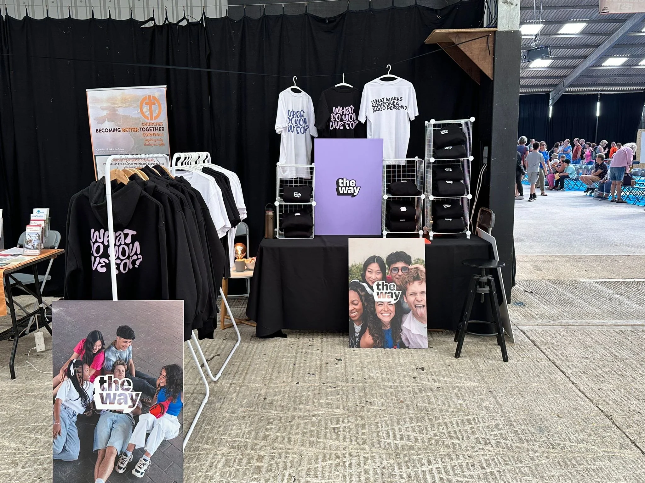
Following the rebrand, we introduced official The Way merchandise. Check it out on my next project!

